ShopDreamUp AI ArtDreamUp
Deviation Actions
There are two recurring problems I've always found myself facing when dealing with digital art. I'm sure there are a ton of ways to deal with them, but here are a couple of ways I discovered.
The first problem is lightening up dark tones. A lot of cool backgrounds and textures are also, unfortunately, on the dark side. Obviously this has something to do with how you set your computer screen, but I like light in my pics (unless the pic has a dark theme, which is a different story).
I discovered a way to deal with this totally by accident. I was preparing a pic as a gift for an online friend for her birthday. It looked dark to me, so I made the bottom layer a little transparent and put a white layer beneath it. The problem with that was that other layers on top of the bottom layer looked darker than the bottom layer. I didn't want to make those transparent (can't recall why but I think there was some issue).
I removed the transparency on the bottom layer and saved the pic from GIMP's default .xcf to a .jpg. That file had two layers: the combined layers of the .xcf file and a white background layer that GIMP always inserts into a new file by default. I still thought it was dark, so I started playing around with the pic's transparency. Because there was a white background underneath and no other layers in between, this white background added light to the entire pic. (Smile)")
I also discovered with my latest pic that you can use a white or textured white layer over the pic and play around with the transparency to lighten it up a bit. It depends on whether you want a little texture there or just want some brightness to show through from underneath.
The second problem I constantly encounter is making pasted layers, particularly of people, blend into the rest of the pic. I hate the glued-on look. I stumbled upon the smudge tool. It basically does what it says, smudges the area you brush over with your mouse. This, of course, distorts the colors there, but it works nicely for images in underlayers.
I wrote a post on my blog, for instance, about Joseph Campbell's Hero's Journey on the meeting with the goddess and added a pic. In order to get the head of the menacing woman to fit nicely into the background, I had to do a lot of erasing. I chopped off her neck, a lot of hair, and even an ear. The smudge tool really helped remove the sharp outlines from those changes and blend into the background. You can, of course, notice distortion if you view a big version of the pic, but it's invisible in the post.
Shamanic Transformation into Nightbird
The first problem is lightening up dark tones. A lot of cool backgrounds and textures are also, unfortunately, on the dark side. Obviously this has something to do with how you set your computer screen, but I like light in my pics (unless the pic has a dark theme, which is a different story).
I discovered a way to deal with this totally by accident. I was preparing a pic as a gift for an online friend for her birthday. It looked dark to me, so I made the bottom layer a little transparent and put a white layer beneath it. The problem with that was that other layers on top of the bottom layer looked darker than the bottom layer. I didn't want to make those transparent (can't recall why but I think there was some issue).
I removed the transparency on the bottom layer and saved the pic from GIMP's default .xcf to a .jpg. That file had two layers: the combined layers of the .xcf file and a white background layer that GIMP always inserts into a new file by default. I still thought it was dark, so I started playing around with the pic's transparency. Because there was a white background underneath and no other layers in between, this white background added light to the entire pic.
I also discovered with my latest pic that you can use a white or textured white layer over the pic and play around with the transparency to lighten it up a bit. It depends on whether you want a little texture there or just want some brightness to show through from underneath.
The second problem I constantly encounter is making pasted layers, particularly of people, blend into the rest of the pic. I hate the glued-on look. I stumbled upon the smudge tool. It basically does what it says, smudges the area you brush over with your mouse. This, of course, distorts the colors there, but it works nicely for images in underlayers.
I wrote a post on my blog, for instance, about Joseph Campbell's Hero's Journey on the meeting with the goddess and added a pic. In order to get the head of the menacing woman to fit nicely into the background, I had to do a lot of erasing. I chopped off her neck, a lot of hair, and even an ear.
Shamanic Transformation into Nightbird

Permissions, artistic effects, unity
The Magical Backgrounds competition on Flickr really helps me expand my skills. Besides having to use the background, I get to see how others have and be inspired.
One thing that strikes me about many of the works I admire is that they have unity. They seem to have a dynamic energy where everything flows together. I feel like that's missing in my work. I was really concentrating on that this time. I tend to go for symmetry, but flow doesn't always have to be symmetrical.
I'd actually created a different picture for my competition entry with a sea and sunset. However, when I double-checked permissions after loading it onto Flickr, I saw that
Proportions, Bump Maps, and Beginning Masks
My entry for the ART UNI INTERNATIONAL – Competition No.115 is in. It's a desert background by H. Kopp-Delaney with a canvas effect, like a painting. I've seen this around and always wondered how you do that. I used some grass in my photo that was a little too perky for the generally dark atmosphere of this background, so I thought a canvas effect would help tone it down. I searched "canvas texture gimp" on Google and stumbled upon a tip from Zach Beane on making a canvas texture. I didn't actually follow the instructions, but he introduced me to the bump map. Man, they're sensitive, but I love the result!
One thing I struggled with in
Hidden Beneath the Layers...
As a Flickr lurker, I'd always see artists entering contests and think that was a really cool way of being inspired and sharing some good karma. I'm a big admirer of some artists from Germany on Flickr, and one of them (H. Kopp-Delaney) is the administrator of a competition. So I figured I'd just go for it.
The background is rather dim, so I played around with brightness and contrast and managed to bring a little more light into it. I recently discovered brushes by Obsidian Dawn, as I wrote in a previous entry, so I played around with a few circles and finally decided I liked the one with the triangle in it. So far, so good.
But it needed s
Learned About Brushes
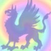
I wrote a blog post on my site about what spirituality means to me that I'll be publishing next week and decided that I really wanted to create a photo to go with it. I was enchanted by a texture I found on Flickr from a woman named Johanne (AKA HocusFocusClick). She has an eye for color and abstract shapes. The texture has rainbow colors and a feather motif going on that make it very dynamic, which is how I feel spiritual energy is.
As I was looking for a photo for another post, I ran across a mask on morgueFile from a woman named laetitia from Amsterdam. It has a black and white face that's sort of shooting through the air with streaks beh
© 2011 - 2024 rainbowgryphon
Comments0
Join the community to add your comment. Already a deviant? Log In